Alycia Oz • Graphic Designer
Welcome to my portfolio, where creativity meets purpose. As a Detroit-based graphic designer, I craft visual stories that captivate and inspire. Through innovative design solutions, I aim to collaborate with companies that share a passion for impactful and visually compelling communication.
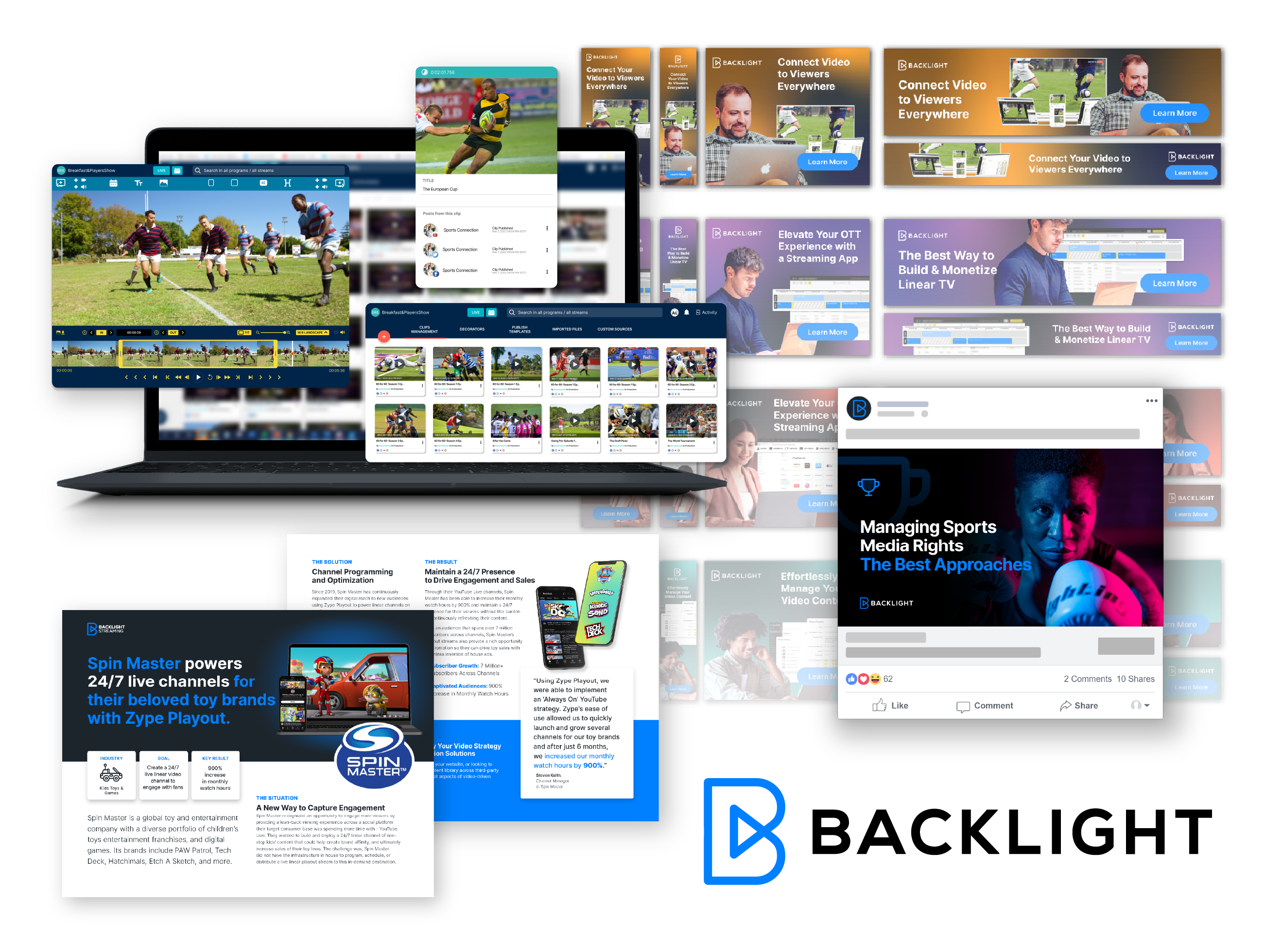
Driving Engagement for Backlight’s Zype and Wildmoka OTT Solutions
Backlight, with its acquisitions of Zype and Wildmoka, aimed to strengthen its position in the OTT streaming market. This project focused on designing cohesive social media campaigns, paid ads, and landing pages that highlighted Zype’s app creation tools and Wildmoka’s content creation platform, making them accessible and visually appealing to a broad audience of media professionals.
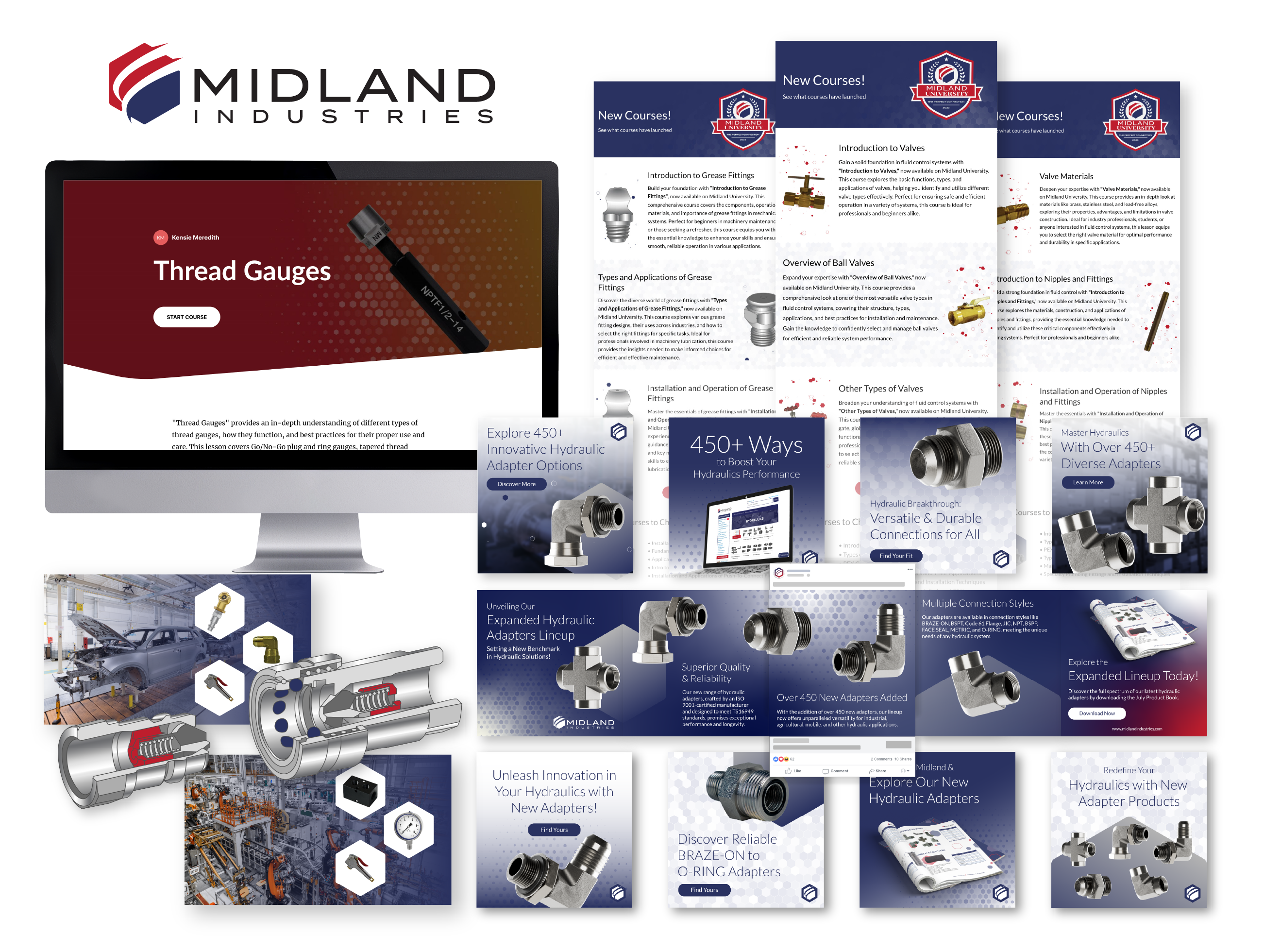
Boosting Brand Engagement for Midland Industries’ Hydraulic Adapters Line
Midland Industries, a leader in fittings and valves with a yearly revenue of $157 million, needed a strategic branding campaign to highlight their expanded hydraulic adapter product line. The project involved creating consistent and professional social media posts, blog content, and email campaigns, all while reinforcing Midland’s established brand identity.
Elevating Backlight’s Brand in the Toys and Games Industry through Comprehensive Digital Design
Backlight, a leader in video content management and distribution, sought a visually engaging design strategy to promote their streaming solutions for the toys and games industry. The project involved creating social media ads, paid campaigns, white papers, and landing pages that captured the playful nature of the industry while showcasing Backlight’s technical capabilities.
Reimagining Ballooms: A Vibrant and Playful Brand Identity for an Event Décor Leader
Ballooms, a custom balloon installation company, required a complete brand overhaul to capture the playful spirit of their services while appealing to both corporate and private clients. The project included logo redesign, color palette development, typography selection, and the creation of a comprehensive style guide, ensuring consistency across marketing materials, social media, and events.
Establishing Cyolo’s Brand Identity in the Cybersecurity Industry with Impactful Visual Design
Cyolo, a cybersecurity leader in Zero Trust Access solutions, needed a unified visual strategy to communicate the sophistication of their platform across digital and physical channels. This project included designing social media graphics, banner ads, white papers, and trade show booths, all aligned with Cyolo’s rebranded guidelines to ensure consistency and appeal across formats.
Let's chat.
Case Study: OTT Streaming Solutions
Client Overview
Backlight, a technology company backed by PSG with a $200 million investment, recently acquired ftrack, iconik, Celtx, Wildmoka, and Zype to expand its portfolio of media solutions. With a mission to enhance the media content lifecycle, Backlight provides cloud-based tools for media companies and content creators. The company's acquisitions allow smaller brands like Zype and Wildmoka to focus on creating the best OTT streaming solutions while benefiting from Backlight’s scale and infrastructure. By partnering with Backlight, we helped promote their diverse offerings through cohesive social media campaigns, paid ads, and idealized UI designs, effectively elevating their brand presence in the OTT streaming space.
Scope
Art Direction / Creative Direction / Graphic Design / Social Media & Digital Advertising / Campaign Strategy / UI/UX
Project Goals
This project aimed to drive awareness and engagement for Backlight Streaming’s capabilities, with a focus on promoting their webinars and showcasing the unique features of Zype and Wildmoka. We crafted visually compelling social media posts, incorporating vibrant colors and clear calls to action to differentiate the offerings, and promoted webinars like “Wildmoka and Zype: Strategies for Selling Backlight Streaming” with sleek, industry-targeted imagery. Paid ad campaigns, including “Zype Apps Creator” and “Monetize Linear TV,” featured dynamic, tech-savvy designs with actionable CTAs to maximize engagement across platforms like Google Ads and social media. To complement these efforts, we developed a high-converting landing page with product shots, customer testimonials, explainer videos, and strategically placed CTAs to guide users through a seamless journey. Additionally, we created idealized UI mock-ups to showcase Zype and Wildmoka’s platform capabilities, making complex tools visually accessible and user-friendly for potential customers.
Challenges
• Balancing technical detail with simplicity in the design and messaging to ensure that the ads and social media posts resonated with both industry professionals and potential users unfamiliar with Zype and Wildmoka’s technical aspects.
• Creating dynamic UI mock-ups that were both engaging and informative, showing users a realistic yet aspirational version of how the platforms could fit into their workflows.
Results
• The social media and paid ad campaigns significantly increased brand visibility, driving engagement and boosting webinar sign-ups, as well as landing page traffic.
• The intuitive landing page design maximized conversions, resulting in a noticeable increase in form submissions and requests for platform demos.
• The idealized UI mock-ups successfully conveyed the value proposition of both Zype and Wildmoka, helping potential users visualize the ease and effectiveness of these platforms for content distribution.
Conclusion
Our collaboration with Backlight Streaming resulted in a cohesive and impactful digital campaign that effectively showcased their suite of OTT streaming tools. By aligning the visual design with strategic goals, we enhanced brand engagement across social media, paid ads, and landing pages while simplifying the user experience with clean UI mock-ups. This project demonstrated the power of a well-coordinated, multi-faceted approach to digital marketing, positioning Backlight, Zype, and Wildmoka as leaders in the OTT streaming space.
Let's chat.
Case Study: Hydraulic Adapters Line Expansion
Client Overview
Midland Industries, a leading provider in the fittings, valves, hose, and accessories market, boasts an annual revenue of $157 million and a valuation exceeding one billion dollars. Recently, Midland launched a comprehensive branding and marketing campaign to promote their expanded hydraulic adapter product line. The primary focus was to engage their customer base through targeted social media posts, blog content, and email campaigns, all while ensuring strict adherence to their brand guidelines.
Scope
Art Direction / Creative Direction / Graphic Design / Social Media & Digital Advertising / Campaign Strategy / Content Creation / Project Management
Project Goals
The goal of this project was to increase awareness of Midland's expanded hydraulic adapter product line while maintaining brand consistency across all media channels. We designed a series of cohesive social media posts and carousels that adhered to Midland’s brand guidelines, incorporating key elements like hexagonal shapes and strategic use of color to highlight the product lineup. These posts, featuring over 450 new hydraulic adapters, were crafted to drive customer engagement through interactive call-to-actions. For blog content, we provided creative direction for imagery and headers, ensuring that the visuals aligned with Midland's values of innovation and quality while supporting the expanded hydraulic line's narrative. Additionally, we collaborated with the email design team to ensure that email campaigns were consistent with Midland’s branding and clearly communicated the product launch. These emails were structured to drive engagement and offered a direct link to the product catalog, successfully encouraging readers to explore Midland’s hydraulic solutions.
Challenges
• Maintaining brand consistency while introducing fresh, engaging content across different platforms.
• Coordinating a multi-disciplinary team of designers and copywriters while adhering to project timelines.
Results
• Increased social media engagement with well-received carousel posts, showcasing the hydraulic adapters.
• The blog content, supported by strong visuals, drove significant traffic to Midland’s website, with the expanded product line as a focal point.
• The email campaign achieved high open and click-through rates, leading to increased product catalog downloads and inquiries about the new hydraulic adapters.
Conclusion
This project successfully aligned Midland Industries' branding with their marketing objectives. The consistent use of visual themes, such as the hexagon motif, combined with compelling copy and strong calls to action, created a cohesive campaign that effectively engaged Midland’s customer base. By coordinating a multi-disciplinary team, we successfully showcased the brand’s commitment to innovation and quality, resulting in a highly successful product launch.
Let's chat.
Case Study: Toys and Games Industry Solutions
Client Overview
Backlight, a leading provider of video content management and distribution solutions, is backed by a $200M investment from PSG and has acquired several well-known brands, including Zype and Wildmoka. Backlight serves media, entertainment, and video-forward customers, offering cloud-based tools that streamline content creation, management, and distribution. As part of a comprehensive marketing campaign, Backlight sought a cohesive design strategy to promote their innovative streaming solutions to the toys and games industry.
Scope
Art Direction / Creative Direction / Graphic Design / Social Media & Digital Advertising / Campaign Strategy / Content Creation / Project Management
Project Goals
The primary objective of this project was to drive engagement with Backlight’s target audience of toy manufacturers and game companies by showcasing their video solutions. The strategy focused on creating a visually unified design across digital channels to reinforce Backlight's brand identity while developing content that resonated with both tech-savvy marketers and parents making purchasing decisions. We executed a social media campaign with vibrant, playful visuals that aligned with the toy and games industry, promoting Backlight’s core offerings like Zype’s OTT streaming and Wildmoka’s real-time content creation tools. Banner and display ads in various sizes were designed with dynamic imagery and concise messaging to increase visibility and drive user action. Informative white papers were also developed with clean layouts, charts, and testimonials, making complex technical information easy to digest for the target audience. Finally, a visually compelling landing page was created, incorporating product visuals, customer testimonials, and clear CTAs to guide users, resulting in increased form submissions and demo requests.
Challenges
• Balancing the playful and engaging nature of the toy industry with Backlight's sophisticated and technical streaming solutions.
• Ensuring that messaging and design appealed to both industry professionals and decision-making parents while maintaining brand consistency across multiple platforms.
Results
• Increased brand visibility across social media and paid ad platforms, resulting in higher engagement and interest from target audiences.
• The white papers and landing pages helped position Backlight as a leader in streaming solutions for the toys and games industry, boosting demo requests and inquiries.
• The cohesive design across all digital assets strengthened Backlight’s brand identity and contributed to measurable business growth, particularly in content consumption and user engagement.
Conclusion
Through this project, I successfully developed a unified visual strategy for Backlight that spanned social media, paid ads, white papers, and landing pages. The designs not only elevated Backlight’s brand presence but also effectively communicated their innovative solutions to the toys and games industry. By creating a visually cohesive and engaging content strategy, I contributed to Backlight’s growth and reinforced their position as a go-to partner for companies looking to enhance their video strategies.
Let's chat.
Case Study: Branding and Style Guide Overhaul
Client Overview
Ballooms, a custom balloon installation company known for creating vibrant and whimsical balloon décor, approached us to undergo a complete brand overhaul. Their goal was to evolve their visual identity into one that not only captures the joy and celebration of balloon installations but also positions them as trendsetters in the event décor industry. With a strong focus on playful yet professional design, the new brand needed to be visually cohesive and easily applied across social media, marketing materials, and events.
Scope
Art Direction / Creative Direction / Graphic Design / Logo Design / Social Media & Digital Advertising / Content Creation / Project Management
Project Goals
The project aimed to create a playful yet professional brand identity for Ballooms, reflecting the joyful essence of their services while maintaining a modern, polished look. By positioning Ballooms as the go-to provider for custom balloon installations in both personal and corporate events, the branding overhaul sought to elevate the company’s presence in the event décor industry. To ensure brand consistency, a comprehensive style guide was developed, adhering to ADA compliance for accessibility. The scope of work included designing a playful logo with both primary and secondary variations for flexibility, developing a vibrant color palette featuring “French Rose” and “Cerulean Sea,” and creating a typographic system using Nunito Black and Montserrat Regular for clarity and readability. Detailed guidelines for logo application and usage were established to maintain brand integrity across various media. Image treatments were also developed, including gradient and single color treatments, to create visually appealing and consistent imagery across marketing materials. Finally, the new branding was extended into social media templates and marketing collateral, resulting in a consistent and engaging brand presence that supported Ballooms’ event promotions and special offerings.
Challenges
• Ensuring the new brand identity felt fresh and exciting while maintaining versatility for different platforms and audiences.
• Striking a balance between playfulness for personal events and professionalism for corporate clients, without alienating either group.
Results
• The new logo, vibrant color palette, and playful typography will significantly improve Ballooms' recognition in the market.
• The comprehensive style guide ensured consistent branding across all media, from social posts to event materials.
• The updated branding helped Ballooms engage new clients by positioning them as leaders in the event décor industry, with a focus on creating memorable, vibrant experiences.
Conclusion
This project successfully transformed Ballooms’ visual identity into a modern, playful, and professional brand. With a comprehensive style guide, vibrant design elements, and a focus on accessibility, Ballooms is now well-positioned to lead in the event décor industry. Their refreshed branding not only captures the essence of joy but also ensures consistency and professionalism across all platforms.
Let's chat.
Case Study: Zero Trust Cybersecurity Solutions
Client Overview
Cyolo, a cybersecurity leader in Zero Trust Access solutions, sought a comprehensive design strategy to visually communicate the technical sophistication of their platform. Cyolo needed a cohesive visual identity that would appeal to both technical stakeholders and corporate decision-makers, while clearly differentiating their Zero Trust solution from traditional network-based approaches. As part of their rebranding, my role was to create high-impact visual content, including social media graphics, banner ads, white papers, and large-format trade show booths.
Scope
Art Direction / Creative Direction / Graphic Design / Social Media & Digital Advertising / Content Creation / Project Management / Large Format Print
Project Goals
The primary objectives for this project were to enhance Cyolo’s brand recognition by establishing a unified and recognizable visual identity across all platforms, effectively communicate their Zero Trust Access solutions in an engaging and digestible manner, and drive user engagement and visibility from digital channels to physical trade show booths. The social media graphics were designed to promote key aspects of Cyolo’s platform, leveraging vibrant brand colors like Lime Green and Navy Blue, while combining real-life photography with futuristic gradients to convey complex ideas in an approachable way. Banner ads, including the “Zero Trust Access: Built for OT with the Speed of IT” campaign, featured bold contrasts, strong calls-to-action, and ensured visibility across digital platforms, resulting in higher click-through rates. White papers, such as the “Architecture Value Workshop,” were designed with clean layouts, bold headings, and well-placed call-out sections, making technical information accessible and reinforcing Cyolo’s professionalism. Large-format trade show booths featured industrial photography overlaid with signature gradients, attracting attention and showcasing Cyolo’s expertise in protecting operational technology (OT) environments, ultimately generating valuable leads at events.
Challenges
• The complexity of Cyolo’s Zero Trust platform needed to be presented in a way that was easily understood by non-technical audiences, particularly at large-format events like trade shows.
• Ensuring the designs remained visually consistent and clear across a range of formats, from small banner ads to large-scale trade show booths.
Results
• The eye-catching booth designs helped Cyolo generate more leads and attracted significant attention at industry events.
• The visually compelling ads led to a noticeable increase in click-through rates for Cyolo’s digital campaigns.
• By maintaining a unified design language across all mediums, Cyolo strengthened its brand recognition and solidified its position as an industry leader in cybersecurity.
Conclusion
Through a unified and engaging visual strategy, Cyolo was able to enhance its brand presence across digital platforms, white papers, and trade show environments. The consistent application of the new branding, combined with well-designed graphics and layouts, effectively communicated Cyolo’s cutting-edge Zero Trust solutions to both technical and non-technical audiences. As a result, Cyolo not only increased engagement but also reinforced its position as a cybersecurity leader.